UI / Screenshots
The Airflow UI makes it easy to monitor and troubleshoot your data pipelines. Here's a quick overview of some of the features and visualizations you can find in the Airflow UI.
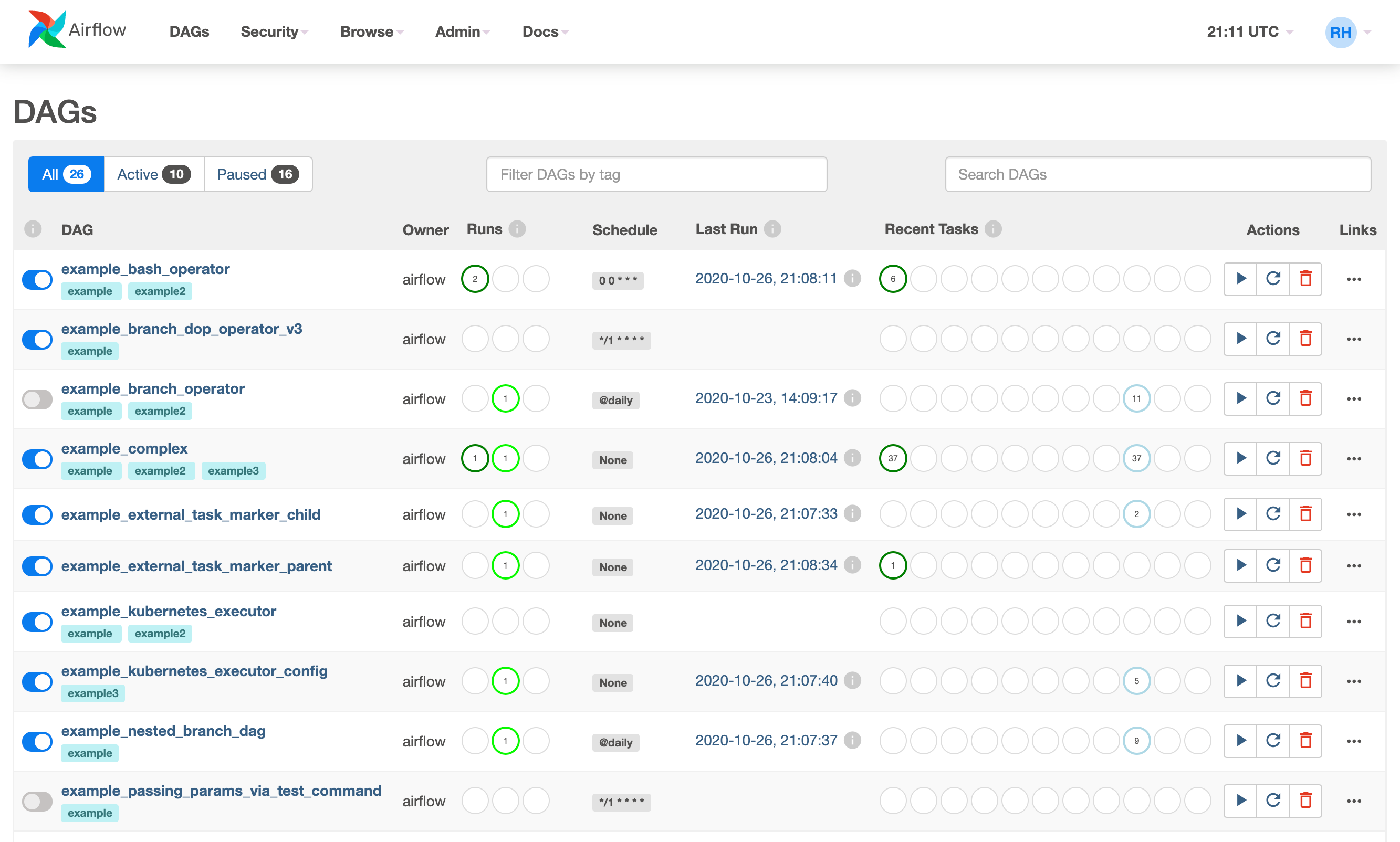
DAGs View
List of the DAGs in your environment, and a set of shortcuts to useful pages. You can see exactly how many tasks succeeded, failed, or are currently running at a glance. To hide completed tasks set show_recent_stats_for_completed_runs = False
In order to filter DAGs (e.g by team), you can add tags in each dag. The filter is saved in a cookie and can be reset by the reset button. For example:
dag = DAG('dag', tags=['team1', 'sql'])
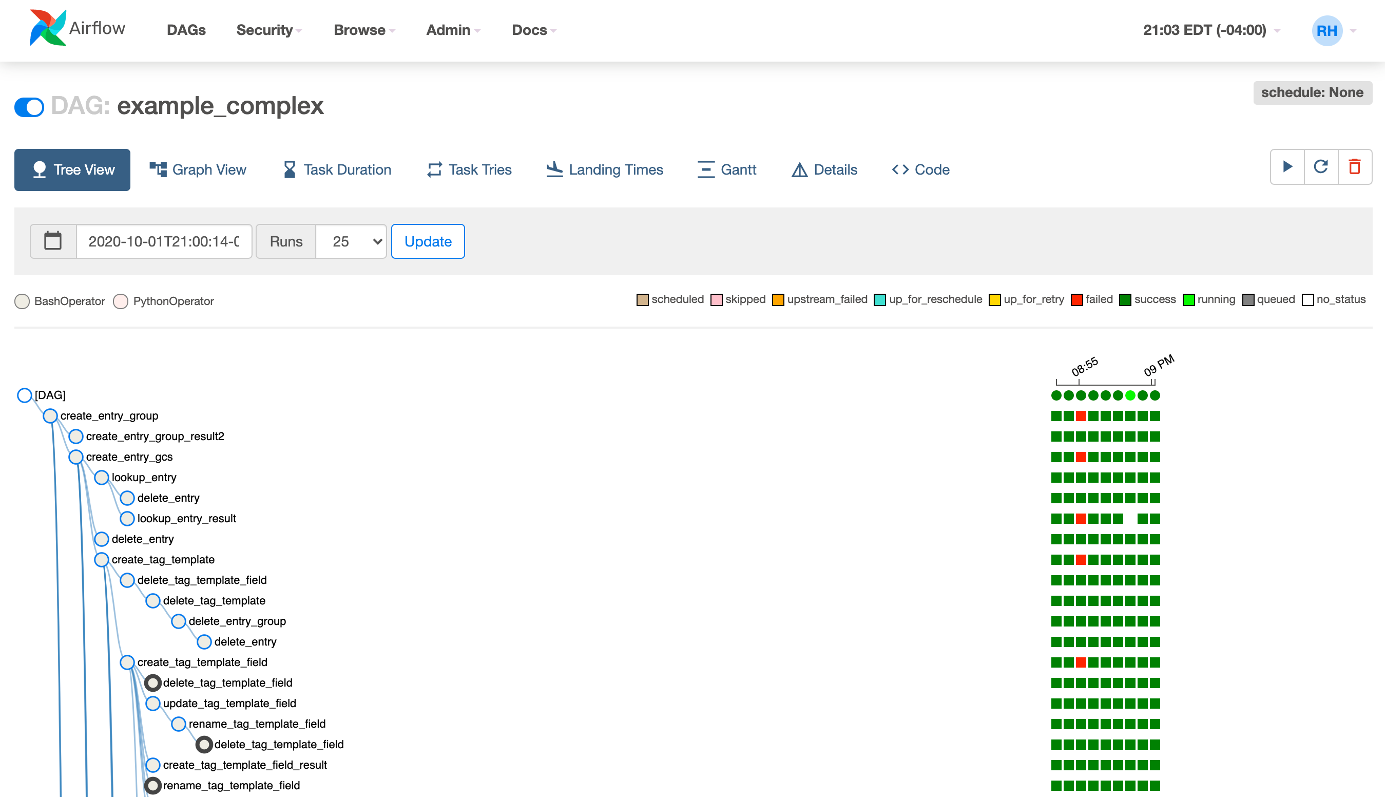
Tree View
A tree representation of the DAG that spans across time. If a pipeline is late, you can quickly see where the different steps are and identify the blocking ones.
There is also visual difference between scheduled and manually triggered DAGs/tasks:

The DAGs/tasks with a black border are scheduled runs, whereas the non-bordered
DAGs/tasks are manually triggered, i.e. by airflow dags trigger.
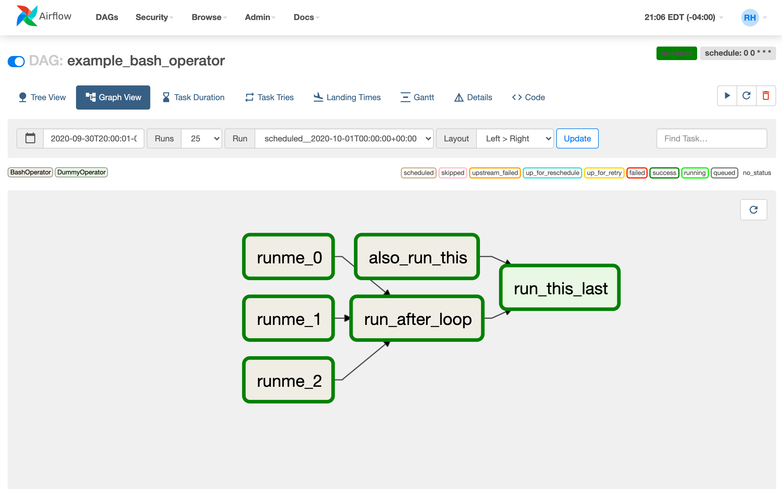
Graph View
The graph view is perhaps the most comprehensive. Visualize your DAG's dependencies and their current status for a specific run.
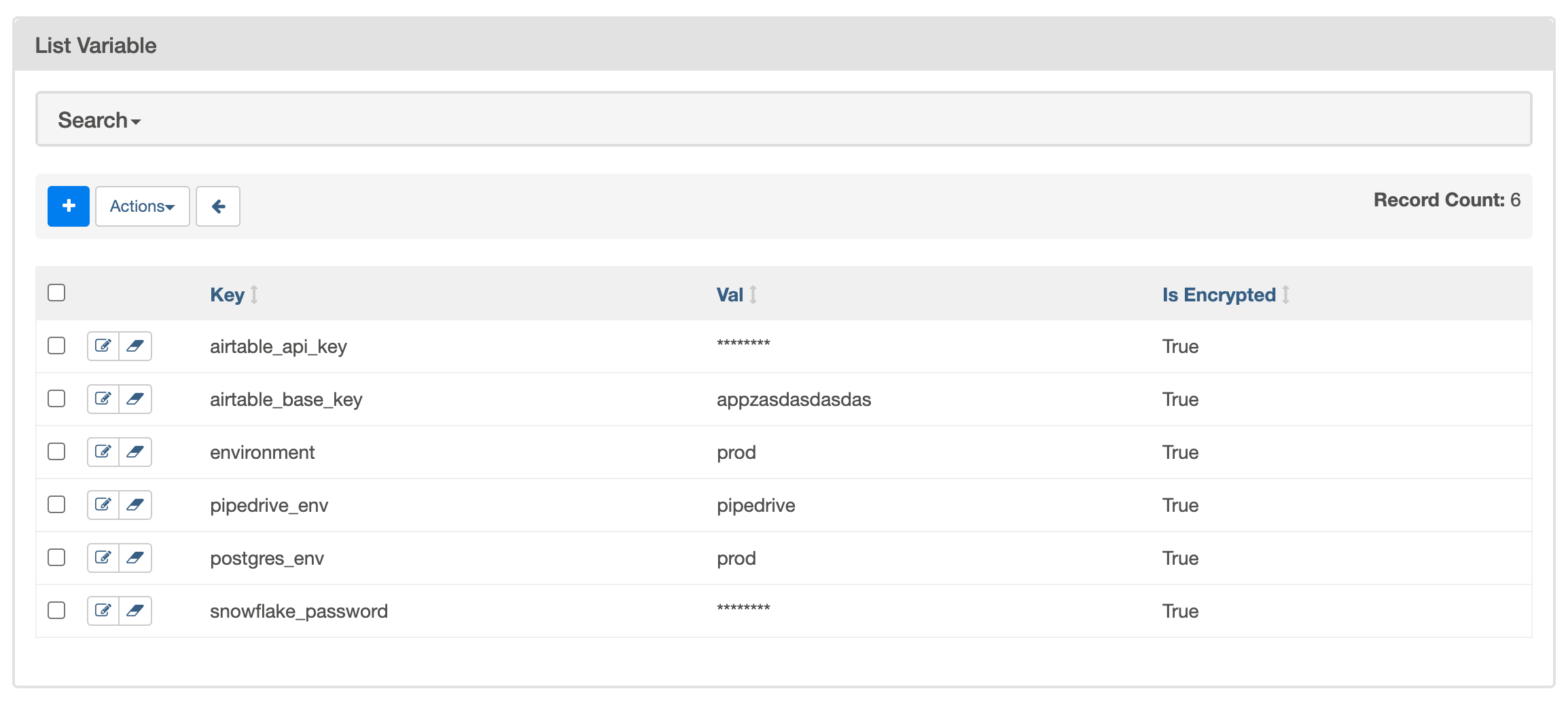
Variable View
The variable view allows you to list, create, edit or delete the key-value pair
of a variable used during jobs. Value of a variable will be hidden if the key contains
any words in ('password', 'secret', 'passwd', 'authorization', 'api_key', 'apikey', 'access_token')
by default, but can be configured to show in clear-text (by configuration option
hide_sensitive_variable_fields).
Users can also extend this list by using the following configurations option:
[admin]
sensitive_variable_fields = comma_separated_sensitive_variable_fields_list
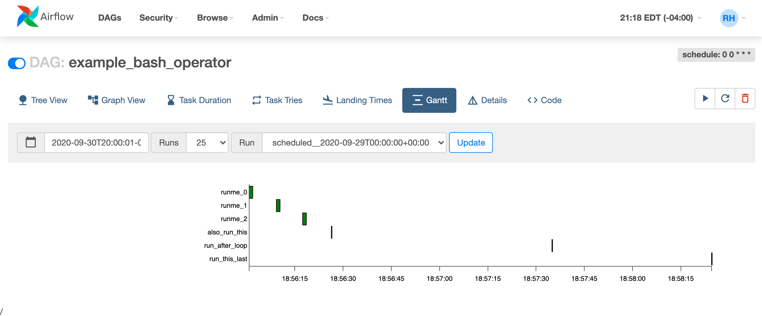
Gantt Chart
The Gantt chart lets you analyse task duration and overlap. You can quickly identify bottlenecks and where the bulk of the time is spent for specific DAG runs.
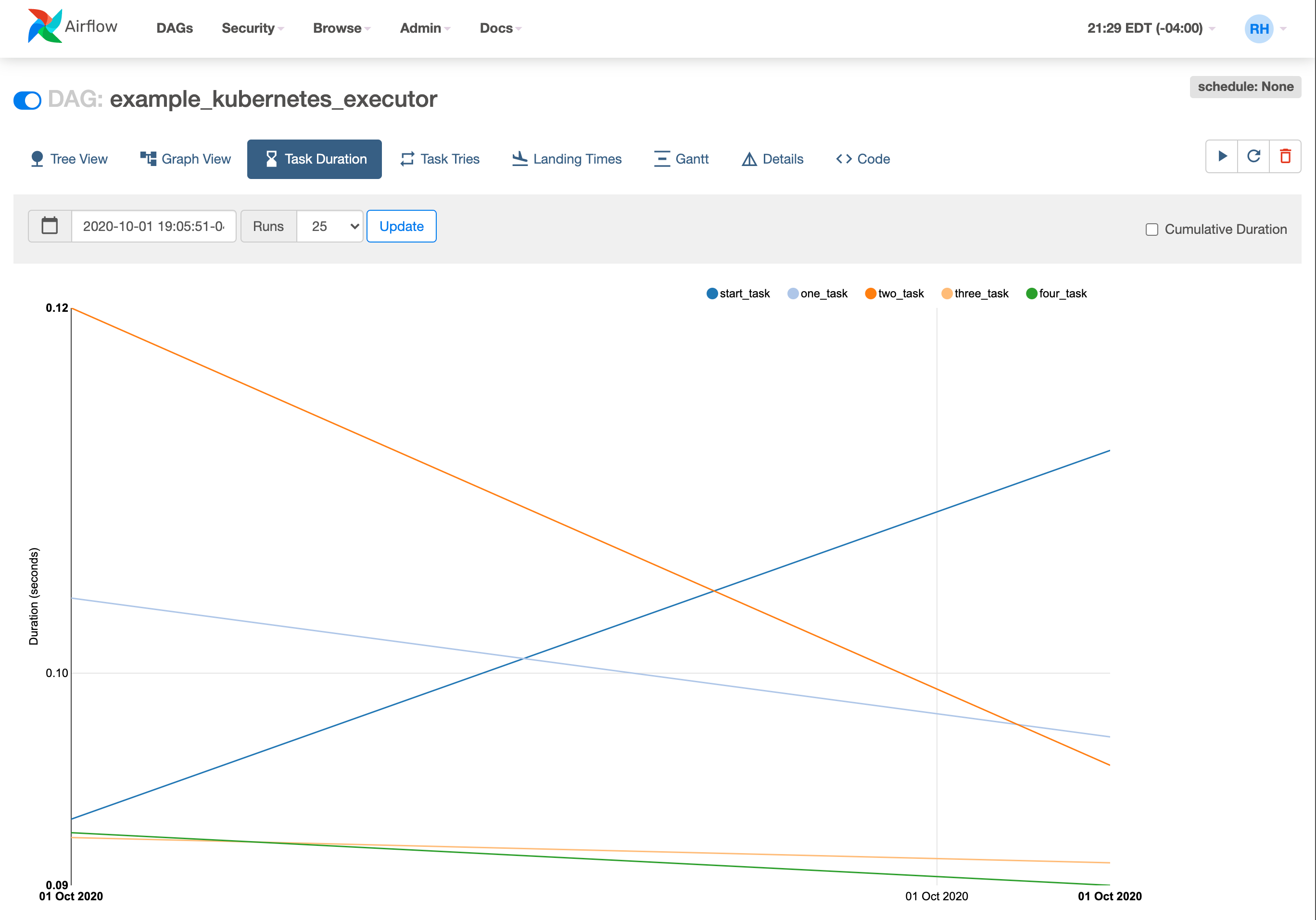
Task Duration
The duration of your different tasks over the past N runs. This view lets you find outliers and quickly understand where the time is spent in your DAG over many runs.
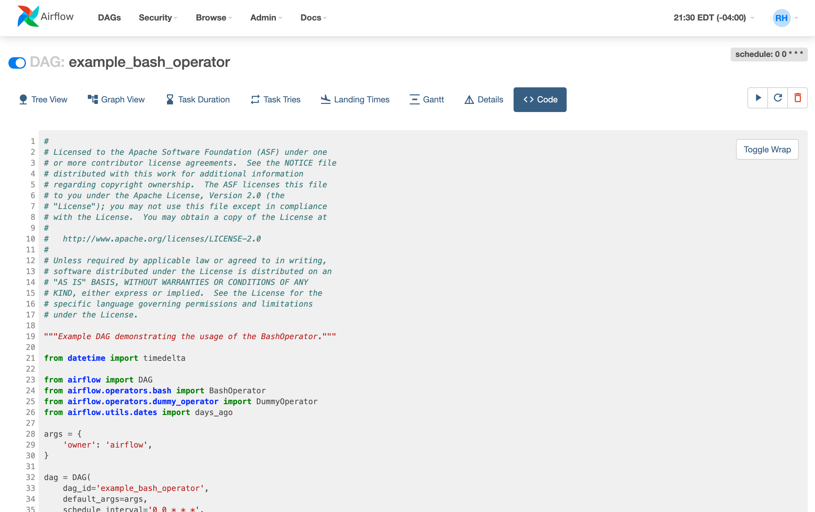
Code View
Transparency is everything. While the code for your pipeline is in source control, this is a quick way to get to the code that generates the DAG and provide yet more context.
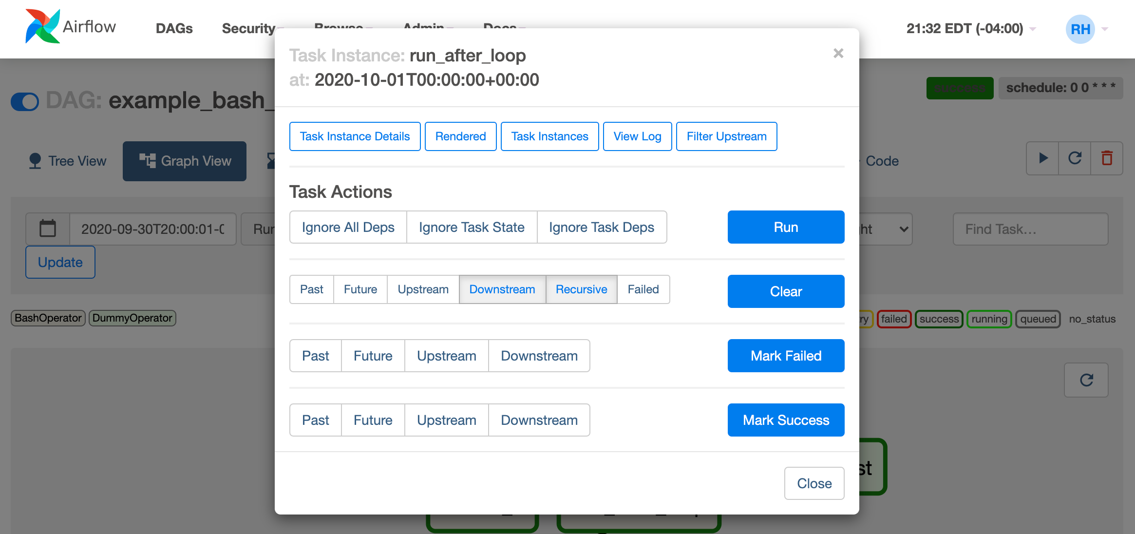
Task Instance Context Menu
From the pages seen above (tree view, graph view, gantt, ...), it is always possible to click on a task instance, and get to this rich context menu that can take you to more detailed metadata, and perform some actions.